Every few years a brand needs to take a hard look at itself. For Fortegra, that moment came when leadership recognized that the visual identity had drifted behind where the company actually was. The mountain mark was right. The equity was there. But the execution needed to grow up.
What followed was a full visual refresh: a refined logo, a completely reworked color system, a new pattern language, a custom icon set, and the rollout of all of it across every surface the company touches. I was involved at nearly every stage, from early concepting through final implementation, and I led the pieces shown here.
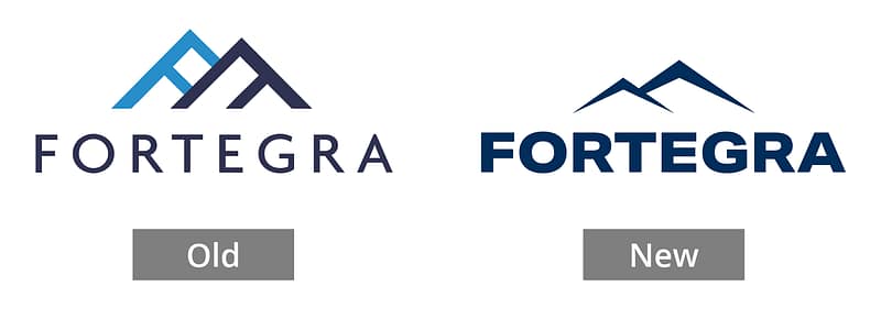
The Logo
The original Fortegra logo had good bones: a triangular mountain mark that spoke to strength and forward momentum. But the wordmark lacked refinement, and the overall mark wasn’t as ownable as we needed it to be.
Our creative manager Jen led the logo design process. My involvement was in the early concepting phase and the final selection rounds. I sat in the direction conversations, helped shape the criteria we were evaluating against, and contributed concepts during exploration. The final mark, cleaner geometry, better type, a single confident color, was chosen by the CEO from our shortlist.
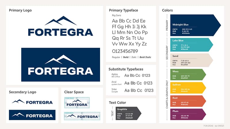
Brand Guidelines
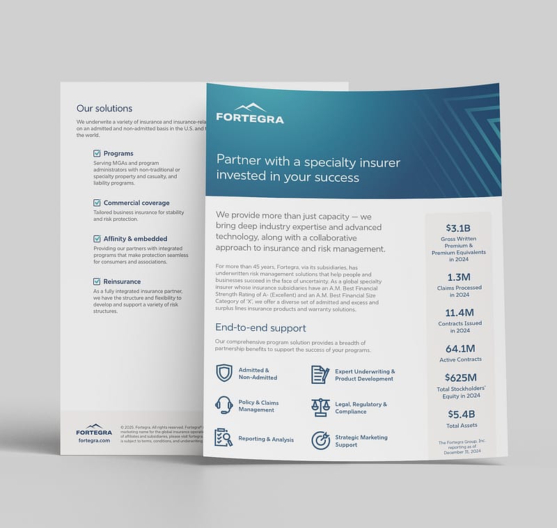
Every element of the refresh was codified into a “quick reference” brand guidelines document: logo usage rules, clear space, primary and substitute typefaces (Rig Sans for Adobe, Aptos for Office, Arial for system, Inter for Google), color values for print and screen, photography direction, and a clear framework for what is and isn’t on-brand.
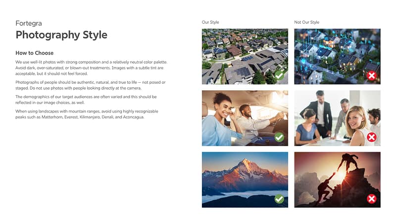
The photography guidance is worth noting specifically. We defined a distinct visual style emphasizing authentic, well-lit, natural images with a neutral palette, and even specified which mountain peaks to avoid in stock photography to prevent the brand from feeling generic. That level of specificity is what makes guidelines actually useful.
Patterns
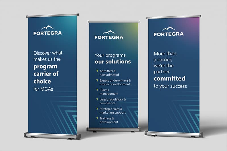
To give the brand more visual texture and flexibility, we brought in an outside vendor to develop a signature pattern system. I reviewed concepts, proved direction through rounds of feedback, and made sure the final patterns felt like they belonged to Fortegra and not just to a stock library.
The patterns are live on fortegra.com and across marketing materials today.
Icons
Fortegra needed a set of ownable icons that felt consistent with the new brand, not pulled from a stock library, not mismatched across departments. I designed the full icon set from scratch: establishing the visual rules, working through the full range of concepts needed, and producing a system that could grow over time.
Having a proprietary icon set sounds like a small thing until you don’t have one and every presentation looks slightly different depending on who pulled the assets.
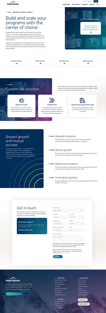
Brand in Action
The logo and guidelines are only as good as their implementation.
Here’s a look at materials I either designed myself or oversaw through rollout.